M1, M3, M5 – these BMW M sub-brand models get the pulse of many car enthusiasts racing. Just as familiar are the colors of the M logo. But where do they come from? And who created the trademark? Keep reading to find out.
That the “M” of BMW M originally stood for “motorsport” is well known among car aficionados. But where did BMW’s sporty offshoot get its colors?
BMW M Logo Motorsport (1973)
BMW M GmbH colors, the result of a collaborative project
Every great success story has a myth attached to it, and the same is true for the BMW M logo and colors. The following BMW staff were involved in selecting the colors for the design of the motorsport division at BMW in 1972: Jochen Neerpasch (then race director and co-managing director of BMW Motorsport GmbH), Wolfgang Seehaus (then BMW interior designer), and Manfred Rennen (then BMW exterior designer).
BMW M GmbH was founded in 1972 as a business unit for the sporty products of the BMW brand. At that time the official name was still BMW Motorsport GmbH. It wasn’t until 1993 that it became BMW M GmbH.
The newly created sports car division was meant to combine and professionalize BMW’s racing activities under a single, unified corporate identity. The unifying element for all of this was to be a crisp color scheme. Designer Seehaus was part of the team in charge of it, and he was the one who created the BMW M colors of blue, violet and red.
“Blue stands for BMW, red for motorsport and violet for the unique combination of the two.”

BMW’s M logo: a symbol with a strong brand value
Marc Thiesbürger, car and racing historian for BMW Group Classic, can draw on various archive sources and recorded recollections from those who were there. According to his interpretation of the color combination, the blue stands for BMW, the red was likely inspired by Texaco and the violet was chosen as a blend of the two. When asked about the story behind Texaco, he says: “It is very likely that the red in the BMW Motorsport color scheme represented Texaco, despite the fact that sponsoring negotiations with the company broke down at the end of 1972 and the deal never came to be.”
Thiesbürger considers this plausible due to the fact that Seehaus had already incorporated the Texaco logo into new racing car designs in 1972, as backed up by various design drawings in the BMW Group archives. This was at a time when BMW was participating in racing events with the support of Castrol – whose logo was the familiar green. According to Thiesbürger, it was unusual to add in the red just as negotiations with Texaco were beginning, but could perhaps have been an attempt to win the company over.
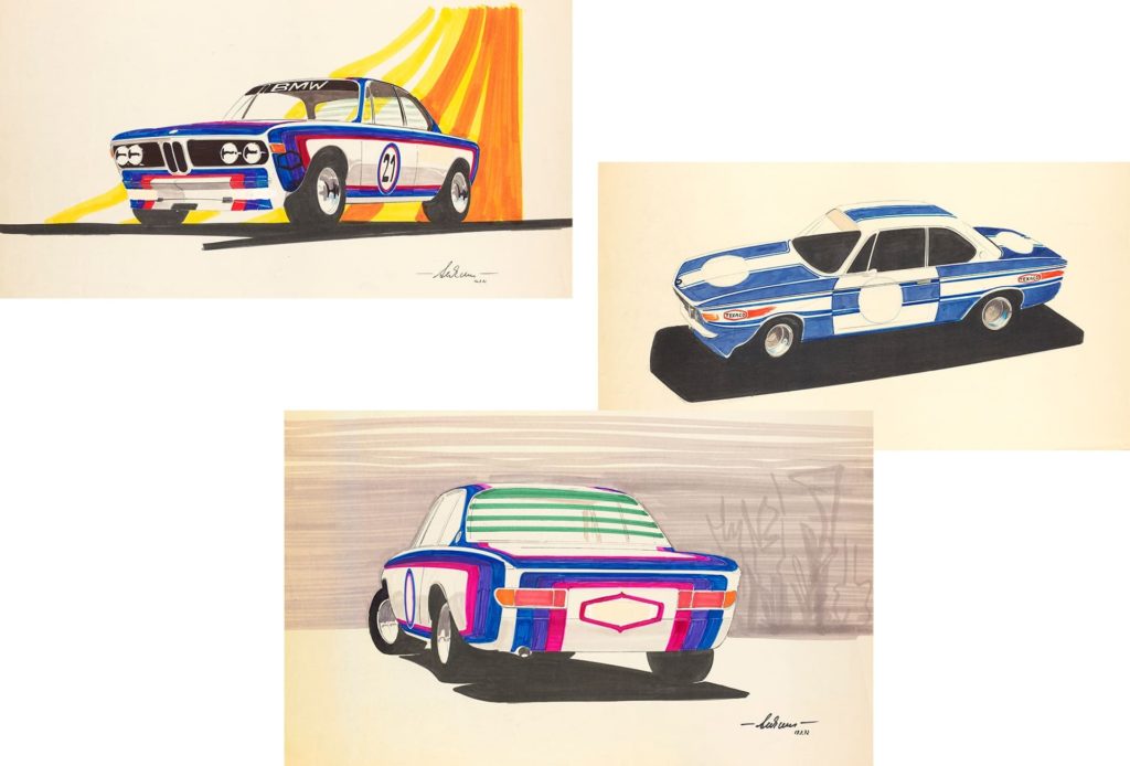
Design drawings by Wolfgang Seehaus of the BMW 3.0 CSL
Seehaus’s colleague Manfred Rennen also claimed to have been involved in the design of the logo’s colors, although Thiesbürger notes that there are no historical documents to verify this. While Jochen Neerpasch confirmed this enduring Texaco legend, Rennen denied that Texaco had played a role in the color scheme.
Racing debut on the BMW 3.0 CSL
Former racing director of BMW Jochen Neerpasch claims Seehaus also chose these colors because of the good differentiation on black and white photos. According to BMW M itself: “Blue stands for BMW, red for motorsport and violet for the unique combination of the two.” If you replace purple with dark blue, this still holds true today.
The tricolor M logo quickly found its way onto the racing cars of Bayerische Motoren Werke. The striking color design was given its racing debut in 1973 on the BMW 3.0 CSL, which would also go on to become a BMW icon as a result. According to Neerpasch, external graphic designer Pierre Mendell was responsible for the vehicle’s final design in cooperation with BMW designer Rennen. To this day, the performance cars in the racing division still sport the renowned M colors in various sizes and designs.
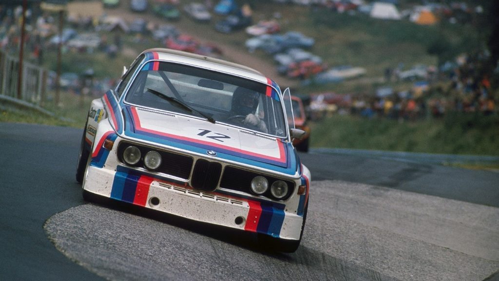
BMW 3.0 CSL (1973)
Over the years, the design of the M logo and the M stripes has been carefully refined, with the color purple changed to a dark blue, for example. The most recent update to the corporate design was made in March 2020 and since then the BMW M communication logo has been sporting its new look solely for brand communication. It is now two-dimensional as opposed to three, and features four colors – light blue, dark blue, red and a white “M”.
BMW M’s pioneering achievement
The origin of the BMW M colors is a multifaceted tale. What we do know is that BMW designer Wolfgang Seehaus played a leading role. And that BMW designer Manfred Rennen was, at the very least, involved in designing the stripes. The Müller graphic design agency was responsible for creating the BMW M emblem, while the final stripes for vehicles came from design studio Pierre Mendell. In short, therefore, the logo was something of a collaborative effort.
“The creation and use of the BMW M colors can be viewed as a pioneering achievement in terms of corporate identity,” says BMW Group Classic expert Thiesbürger. This is demonstrated by the fact that the colors and the design have only been marginally altered since they were first launched in the 1970s. And why would anyone want to change it? Nowdays it’s not only car enthusiasts who recognize that the M logo has represented BMW’s sportiest model for decades.
Source: BMW.COM

You must be logged in to post a comment.